
Python: Seaborn
Utilizzo l’environment conda py3
1
~$ conda activate py3
Versione modulo installato
1
2
3
4
5
6
7
8
9
10
11
~$ pip show seaborn
Name: seaborn
Version: 0.10.1
Summary: seaborn: statistical data visualization
Home-page: https://seaborn.pydata.org
Author: Michael Waskom
Author-email: mwaskom@nyu.edu
License: BSD (3-clause)
Location: /home/user/miniconda3/envs/py3/lib/python3.7/site-packages
Requires: scipy, matplotlib, pandas, numpy
Required-by:
Seaborn
Documentazione Seaborn
1
2
import seaborn as sns
%matplotlib inline
1
2
tips = sns.load_dataset('tips') # default df in sns
tips.head()
| total_bill | tip | sex | smoker | day | time | size | |
|---|---|---|---|---|---|---|---|
| 0 | 16.99 | 1.01 | Female | No | Sun | Dinner | 2 |
| 1 | 10.34 | 1.66 | Male | No | Sun | Dinner | 3 |
| 2 | 21.01 | 3.50 | Male | No | Sun | Dinner | 3 |
| 3 | 23.68 | 3.31 | Male | No | Sun | Dinner | 2 |
| 4 | 24.59 | 3.61 | Female | No | Sun | Dinner | 4 |
1
2
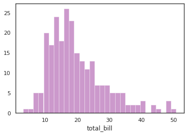
# dist plot (histogram e kernel density estimation)
sns.distplot(tips['total_bill'],kde=False,bins=30,color='purple')
1
<matplotlib.axes._subplots.AxesSubplot at 0x7f7ddeea0c50>
1
2
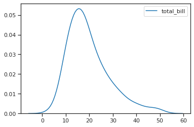
# kde plot
sns.kdeplot(tips['total_bill'])
1
<matplotlib.axes._subplots.AxesSubplot at 0x7f7de3ca07d0>
1
2
3
4
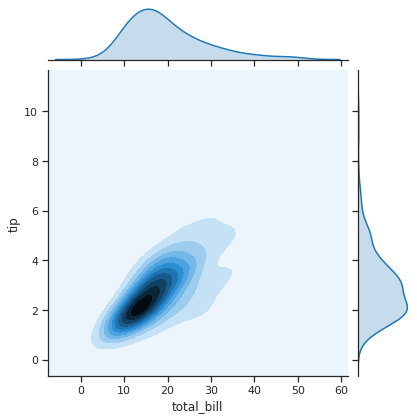
# jointplot
sns.jointplot(x='total_bill',y='tip',data=tips,kind='kde') # kind default è scatter, hex è scatterplot esagonali, reg è scatter con regression, kde è 2dimensianl density
# from scipy import stats
# sns.jointplot(x='total_bill',y='tip',data=tips,color='red',marginal_kws=dict(bins=15, rug=True),annot_kws=dict(stat="r"),s=40, edgecolor="black", alpha=0.4, linewidth=1).annotate(stats.pearsonr) # invece di annotate si può mettere dentro il jointplot "stat_func=stats.pearsonr"
1
<seaborn.axisgrid.JointGrid at 0x7f7de3c96ed0>
1
2
3
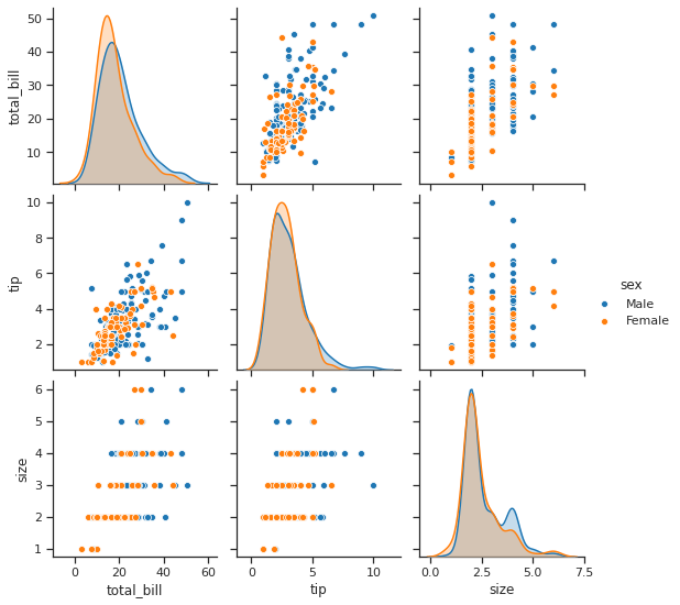
# pairplot, come jointplot per tutto il df
sns.pairplot(tips,hue='sex') # hue specifico le categoriche per fare stratificazione
# sns.pairplot(tips,hue='sex',diag_kind='hist',diag_kws=dict(edgecolor='black',alpha=0.6))
1
<seaborn.axisgrid.PairGrid at 0x7f7de3bfe690>
1
2
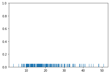
# rug plot, distribuzione univariata
sns.rugplot(tips['total_bill'])
1
<matplotlib.axes._subplots.AxesSubplot at 0x7f7dedf8dad0>
1
2
3
4
5
6
7
8
9
10
11
12
13
14
15
16
17
18
19
20
21
22
23
24
25
26
27
28
29
30
31
32
33
34
35
36
37
38
39
40
41
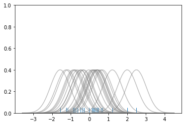
# Don't worry about understanding this code!
# It's just for the diagram below
import numpy as np
import matplotlib.pyplot as plt
from scipy import stats
#Create dataset
dataset = np.random.randn(25)
# Create another rugplot
sns.rugplot(dataset);
# Set up the x-axis for the plot
x_min = dataset.min() - 2
x_max = dataset.max() + 2
# 100 equally spaced points from x_min to x_max
x_axis = np.linspace(x_min,x_max,100)
# Set up the bandwidth, for info on this:
url = 'http://en.wikipedia.org/wiki/Kernel_density_estimation#Practical_estimation_of_the_bandwidth'
bandwidth = ((4*dataset.std()**5)/(3*len(dataset)))**.2
# Create an empty kernel list
kernel_list = []
# Plot each basis function
for data_point in dataset:
# Create a kernel for each point and append to list
kernel = stats.norm(data_point,bandwidth).pdf(x_axis)
kernel_list.append(kernel)
#Scale for plotting
kernel = kernel / kernel.max()
kernel = kernel * .4
plt.plot(x_axis,kernel,color = 'grey',alpha=0.5)
plt.ylim(0,1)
1
(0.0, 1.0)
1
2
3
4
5
6
7
8
9
10
11
12
13
14
15
16
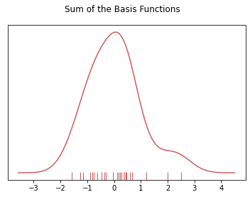
# To get the kde plot we can sum these basis functions.
# Plot the sum of the basis function
sum_of_kde = np.sum(kernel_list,axis=0)
# Plot figure
fig = plt.plot(x_axis,sum_of_kde,color='indianred')
# Add the initial rugplot
sns.rugplot(dataset,c = 'indianred')
# Get rid of y-tick marks
plt.yticks([])
# Set title
plt.suptitle("Sum of the Basis Functions")
1
Text(0.5, 0.98, 'Sum of the Basis Functions')
Categorical Plots
1
import numpy as np
1
2
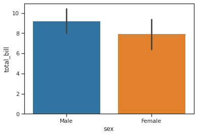
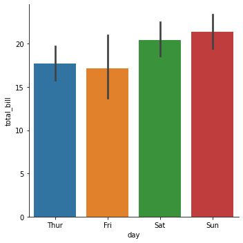
# barplot with function
sns.barplot(x='sex',y='total_bill',data=tips,estimator=np.std) # di default l'estimator è la media
1
<matplotlib.axes._subplots.AxesSubplot at 0x7f7de1d7cfd0>
1
2
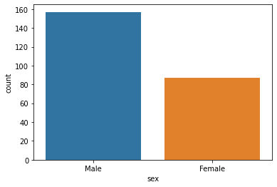
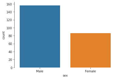
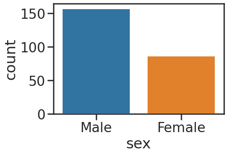
# countplot, barplot
sns.countplot(x='sex',data=tips)
1
<matplotlib.axes._subplots.AxesSubplot at 0x7f7ded503450>
1
2
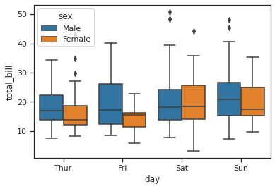
# boxplot
sns.boxplot(x='day',y='total_bill',data=tips,hue='sex') # con hue stratifico
1
<matplotlib.axes._subplots.AxesSubplot at 0x7f7de1d530d0>
1
2
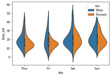
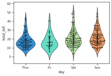
# violin plot
sns.violinplot(x='day',y='total_bill',data=tips,hue='sex',split=True)
1
<matplotlib.axes._subplots.AxesSubplot at 0x7f7dec907f90>
1
2
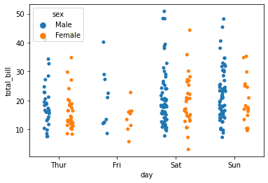
# strip plot
sns.stripplot(x='day',y='total_bill',data=tips,hue='sex',jitter=True, split=True) # con jitter migliora la vista delle sovrapposizioni dei punti
1
<matplotlib.axes._subplots.AxesSubplot at 0x7f7decc7df90>
1
2
3
# swarplot (combina stripplot con violin plot)
sns.violinplot(x='day',y='total_bill',data=tips,palette='rainbow')
sns.swarmplot(x='day',y='total_bill',data=tips,color='black',alpha=0.5)
1
<matplotlib.axes._subplots.AxesSubplot at 0x7f7ddf32bb10>
1
2
# factor o cat plot
sns.catplot(x='day',y='total_bill',data=tips,kind='bar') # kind puoi usare anche violin, ma è analogo ai singoli comandi
1
<seaborn.axisgrid.FacetGrid at 0x7f7dec4a5290>
Matrix Plots
1
2
tips = sns.load_dataset('tips')
flights = sns.load_dataset('flights')
1
tips.head()
| total_bill | tip | sex | smoker | day | time | size | |
|---|---|---|---|---|---|---|---|
| 0 | 16.99 | 1.01 | Female | No | Sun | Dinner | 2 |
| 1 | 10.34 | 1.66 | Male | No | Sun | Dinner | 3 |
| 2 | 21.01 | 3.50 | Male | No | Sun | Dinner | 3 |
| 3 | 23.68 | 3.31 | Male | No | Sun | Dinner | 2 |
| 4 | 24.59 | 3.61 | Female | No | Sun | Dinner | 4 |
1
flights.head()
| year | month | passengers | |
|---|---|---|---|
| 0 | 1949 | January | 112 |
| 1 | 1949 | February | 118 |
| 2 | 1949 | March | 132 |
| 3 | 1949 | April | 129 |
| 4 | 1949 | May | 121 |
1
2
3
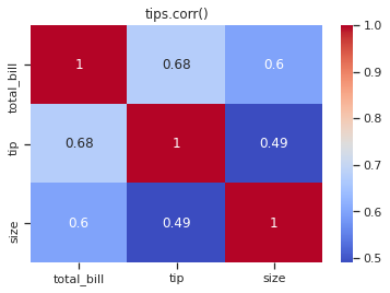
# la heat map necessita la struttura matriciale
tc = tips.corr()
tc
| total_bill | tip | size | |
|---|---|---|---|
| total_bill | 1.000000 | 0.675734 | 0.598315 |
| tip | 0.675734 | 1.000000 | 0.489299 |
| size | 0.598315 | 0.489299 | 1.000000 |
1
2
3
# heat map
sns.heatmap(tc,annot=True,cmap='coolwarm')
plt.title('tips.corr()')
1
Text(0.5, 1.0, 'tips.corr()')
1
2
3
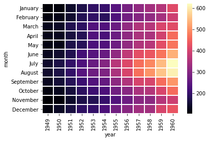
# per il df flights la struttura matriciale si può anche costruire rendendo il df wide
fp = flights.pivot_table(index='month',columns='year',values='passengers')
fp
| year | 1949 | 1950 | 1951 | 1952 | 1953 | 1954 | 1955 | 1956 | 1957 | 1958 | 1959 | 1960 |
|---|---|---|---|---|---|---|---|---|---|---|---|---|
| month | ||||||||||||
| January | 112 | 115 | 145 | 171 | 196 | 204 | 242 | 284 | 315 | 340 | 360 | 417 |
| February | 118 | 126 | 150 | 180 | 196 | 188 | 233 | 277 | 301 | 318 | 342 | 391 |
| March | 132 | 141 | 178 | 193 | 236 | 235 | 267 | 317 | 356 | 362 | 406 | 419 |
| April | 129 | 135 | 163 | 181 | 235 | 227 | 269 | 313 | 348 | 348 | 396 | 461 |
| May | 121 | 125 | 172 | 183 | 229 | 234 | 270 | 318 | 355 | 363 | 420 | 472 |
| June | 135 | 149 | 178 | 218 | 243 | 264 | 315 | 374 | 422 | 435 | 472 | 535 |
| July | 148 | 170 | 199 | 230 | 264 | 302 | 364 | 413 | 465 | 491 | 548 | 622 |
| August | 148 | 170 | 199 | 242 | 272 | 293 | 347 | 405 | 467 | 505 | 559 | 606 |
| September | 136 | 158 | 184 | 209 | 237 | 259 | 312 | 355 | 404 | 404 | 463 | 508 |
| October | 119 | 133 | 162 | 191 | 211 | 229 | 274 | 306 | 347 | 359 | 407 | 461 |
| November | 104 | 114 | 146 | 172 | 180 | 203 | 237 | 271 | 305 | 310 | 362 | 390 |
| December | 118 | 140 | 166 | 194 | 201 | 229 | 278 | 306 | 336 | 337 | 405 | 432 |
1
sns.heatmap(fp,cmap='magma',linecolor='white',linewidths=1)
1
<matplotlib.axes._subplots.AxesSubplot at 0x7f7de7ea59d0>
1
2
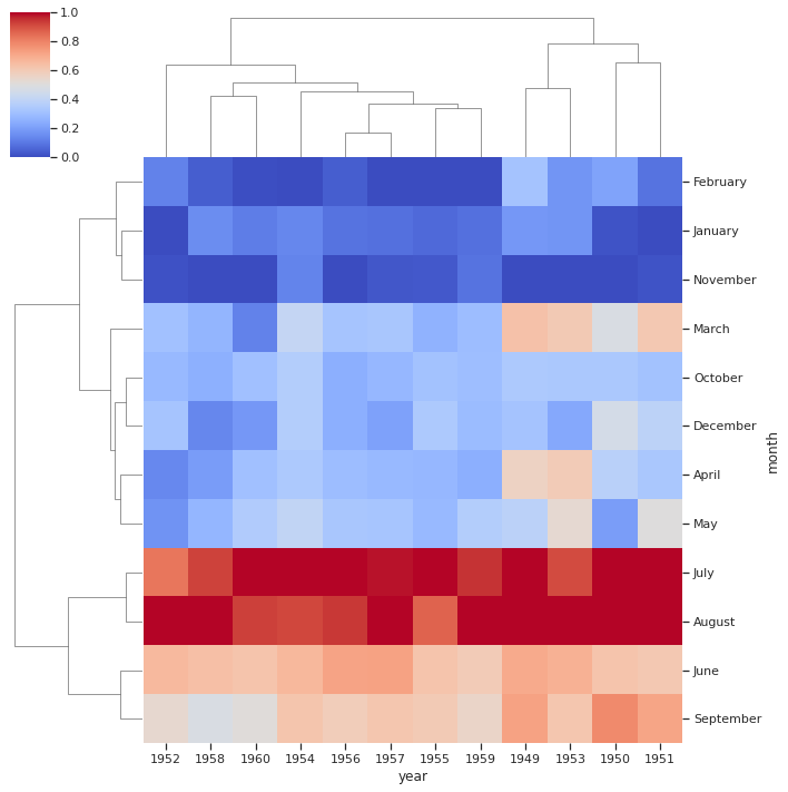
# cluster map (hierarchical)
sns.clustermap(fp,cmap='coolwarm',standard_scale=1)
1
<seaborn.matrix.ClusterGrid at 0x7f7de1cf2b10>
Grids
1
2
iris = sns.load_dataset('iris')
iris.head()
| sepal_length | sepal_width | petal_length | petal_width | species | |
|---|---|---|---|---|---|
| 0 | 5.1 | 3.5 | 1.4 | 0.2 | setosa |
| 1 | 4.9 | 3.0 | 1.4 | 0.2 | setosa |
| 2 | 4.7 | 3.2 | 1.3 | 0.2 | setosa |
| 3 | 4.6 | 3.1 | 1.5 | 0.2 | setosa |
| 4 | 5.0 | 3.6 | 1.4 | 0.2 | setosa |
1
iris['species'].unique()
1
array(['setosa', 'versicolor', 'virginica'], dtype=object)
1
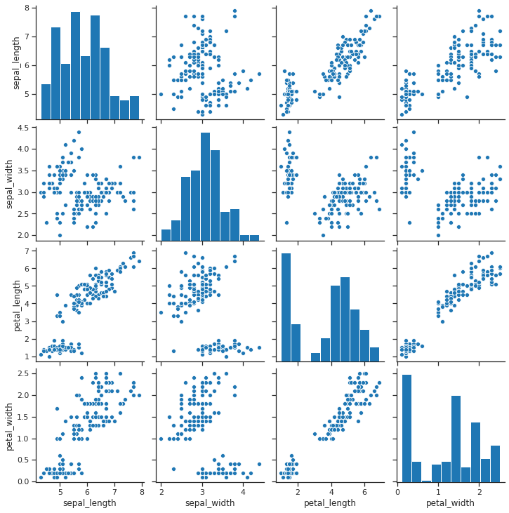
sns.pairplot(iris)
1
<seaborn.axisgrid.PairGrid at 0x7f7de1aed490>
1
2
3
4
5
6
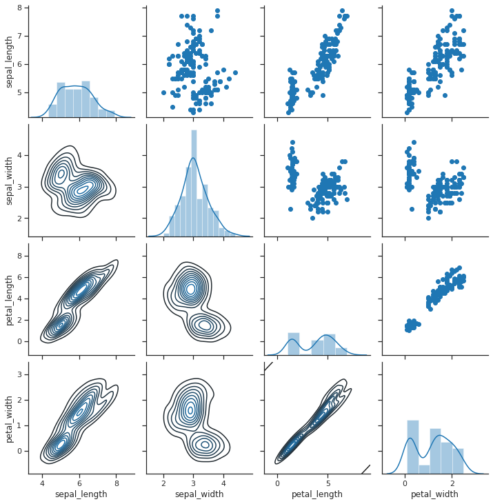
# pairgrid, per personalizzare il pairplot
g = sns.PairGrid(iris)
# g.map(plt.scatter)
g.map_diag(sns.distplot)
g.map_upper(plt.scatter)
g.map_lower(sns.kdeplot)
1
<seaborn.axisgrid.PairGrid at 0x7f7de1ac7c10>
1
2
3
4
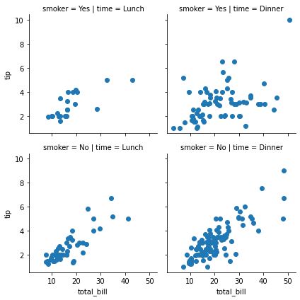
# facegrid, plot condizionali, mix matplotlib
g = sns.FacetGrid(data=tips,col='time',row='smoker')
# g.map(sns.distplot,'total_bill')
g.map(plt.scatter,'total_bill','tip') # invece di plt.scatter si possono usare altri grafici sia di plt che sns
1
<seaborn.axisgrid.FacetGrid at 0x7f7de4d73290>
Regression Plots
1
2
3
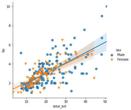
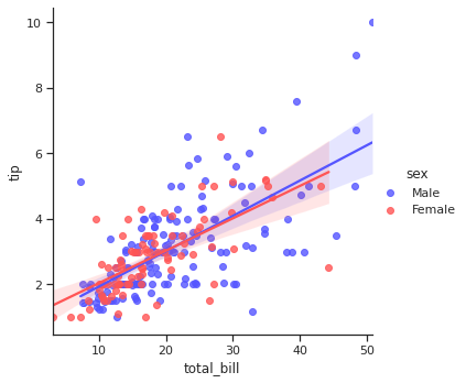
# lm plot
sns.lmplot(x='total_bill',y='tip',data=tips,hue='sex',markers=['o','v'],scatter_kws={'s':50}) # scatter_kws per modificare i parametri di matplotlib sottostante tramite dizionario (es s è il size del marker)
# fit_reg=False per lasciare solo lo scatterplot
1
<seaborn.axisgrid.FacetGrid at 0x7f7de4ad89d0>
1
2
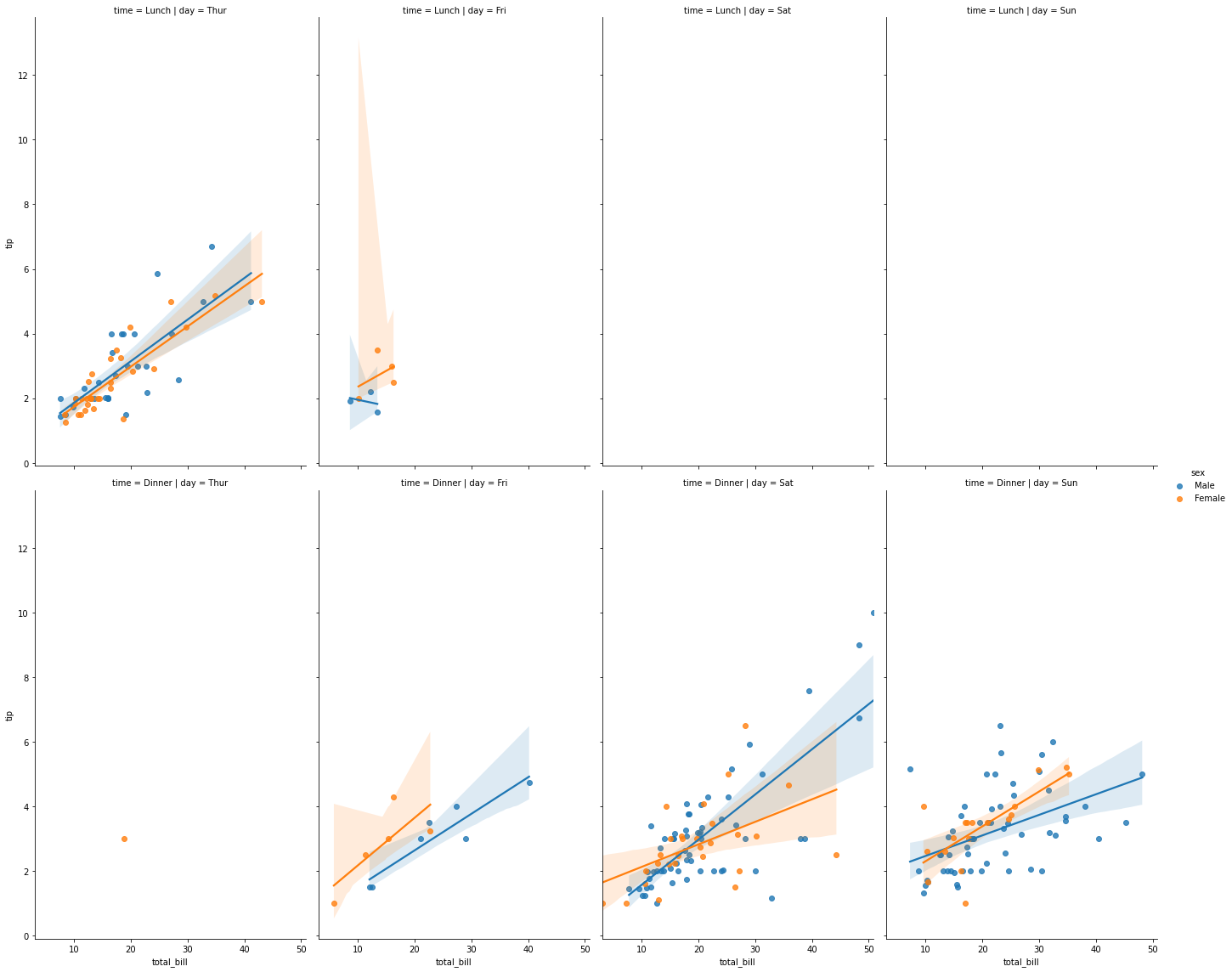
# multiplo by categorical
sns.lmplot(x='total_bill',y='tip',data=tips,col='day',row='time',hue='sex',aspect=0.6,height=8)
1
<seaborn.axisgrid.FacetGrid at 0x7f7de25eaa90>
Style and Color
Styles
1
2
3
4
sns.set_style('ticks')
# sns.set_style('whitegrid')
# sns.set_style('darkgrid')
# sns.reset_orig() # resetta style
1
2
sns.countplot(x='sex',data=tips)
sns.despine(bottom=True)
1
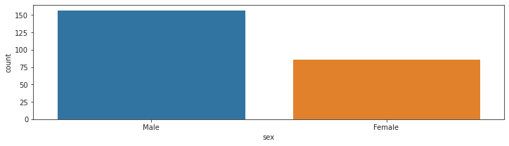
2
plt.figure(figsize=(12,3))
sns.countplot(x='sex',data=tips)
1
<matplotlib.axes._subplots.AxesSubplot at 0x7f7ddf8ddc90>
1
2
sns.set_context('poster',font_scale=1.2)
sns.countplot(x='sex',data=tips)
1
<matplotlib.axes._subplots.AxesSubplot at 0x7f7de56ed810>
Palette
1
2
# sns.set_palette("GnBu_d")
# sns.set_palette("bwr")
1
2
sns.set_context('notebook')
sns.lmplot(x='total_bill',y='tip',data=tips,hue='sex',palette='seismic')
1
<seaborn.axisgrid.FacetGrid at 0x7f7ddf3dbf90>
Altro
1
2
3
# df utile
titanic = sns.load_dataset('titanic')
titanic.head()
| survived | pclass | sex | age | sibsp | parch | fare | embarked | class | who | adult_male | deck | embark_town | alive | alone | |
|---|---|---|---|---|---|---|---|---|---|---|---|---|---|---|---|
| 0 | 0 | 3 | male | 22.0 | 1 | 0 | 7.2500 | S | Third | man | True | NaN | Southampton | no | False |
| 1 | 1 | 1 | female | 38.0 | 1 | 0 | 71.2833 | C | First | woman | False | C | Cherbourg | yes | False |
| 2 | 1 | 3 | female | 26.0 | 0 | 0 | 7.9250 | S | Third | woman | False | NaN | Southampton | yes | True |
| 3 | 1 | 1 | female | 35.0 | 1 | 0 | 53.1000 | S | First | woman | False | C | Southampton | yes | False |
| 4 | 0 | 3 | male | 35.0 | 0 | 0 | 8.0500 | S | Third | man | True | NaN | Southampton | no | True |