1
2
3
4
5
6
7
8
9
10
11
| ~$ pip show matplotlib
Name: matplotlib
Version: 3.2.2
Summary: Python plotting package
Home-page: https://matplotlib.org
Author: John D. Hunter, Michael Droettboom
Author-email: matplotlib-users@python.org
License: PSF
Location: /home/user/miniconda3/envs/py3/lib/python3.7/site-packages
Requires: pyparsing, numpy, cycler, kiwisolver, python-dateutil
Required-by: seaborn
|
1
| Text(0.5, 1.0, 'Title')
|
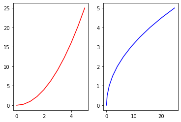
1
2
3
4
5
6
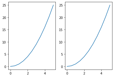
| # multiple plot same canvas
plt.subplot(1,2,1)
plt.plot(x,y,'r-')
plt.subplot(1,2,2) # 1 row, by 2 columns, 2nd plot
plt.plot(y,x,'b')
|
1
| [<matplotlib.lines.Line2D at 0x7f4e6c5409d0>]
|
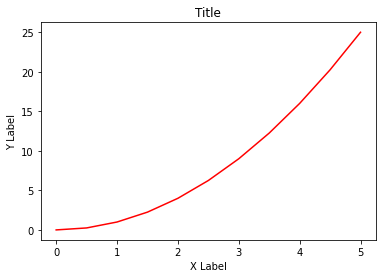
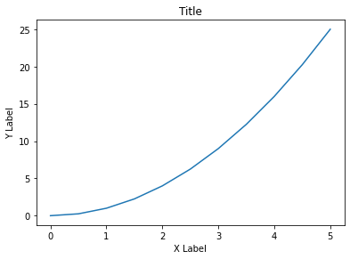
1
2
3
4
5
6
7
8
| fig = plt.figure()
axes = fig.add_axes([0.1,0.1,0.8,0.8]) # left axsis, bottom, width, height
axes.plot(x,y)
axes.set_xlabel('X Label')
axes.set_ylabel('Y Label')
axes.set_title('Title')
|
1
| Text(0.5, 1.0, 'Title')
|
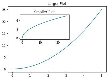
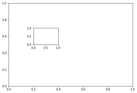
1
2
3
4
5
6
7
8
9
10
11
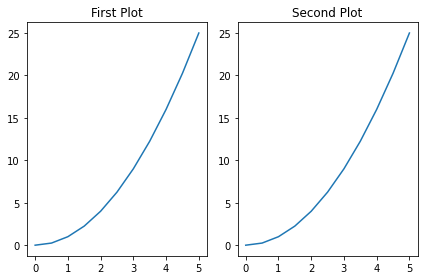
| # multi plot
fig = plt.figure()
axes1 = fig.add_axes([0.1,0.1,0.8,0.8])
axes2 = fig.add_axes([0.2,0.5,0.4,0.3])
axes1.plot(x,y)
axes1.set_title('Larger Plot')
axes2.plot(y,x)
axes2.set_title('Smaller Plot')
|
1
| Text(0.5, 1.0, 'Smaller Plot')
|
1
| [<matplotlib.lines.Line2D at 0x7f4e60dc8750>]
|
1
2
3
4
5
6
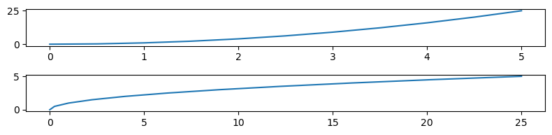
| fig,axes = plt.subplots(nrows=2,ncols=1,figsize=(8,2),dpi=100) # 8 inches
axes[0].plot(x,y)
axes[1].plot(y,x)
plt.tight_layout()
|
1
| '/media/user/Public/Python/Course 001'
|
1
2
3
4
5
6
7
8
9
10
11
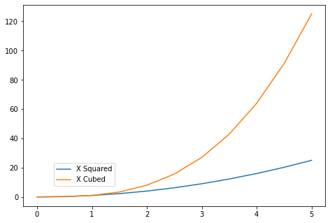
| # legends
fig = plt.figure()
ax = fig.add_axes([0,0,1,1])
ax.plot(x,x**2,label='X Squared')
ax.plot(x,x**3,label='X Cubed')
# per il parametro loc vedi la guida
# https://matplotlib.org/api/pyplot_api.html#matplotlib.pyplot.legend
ax.legend(loc=(0.1,0.1)) # una tupla che specifica la posizione
|
1
| <matplotlib.legend.Legend at 0x7f4e5bae5950>
|
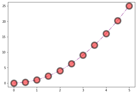
1
2
3
4
5
6
| # colors, line width, trasparenza
fig = plt.figure()
ax = fig.add_axes([0,0,1,1])
ax.plot(x,y,color='purple',lw=2,alpha=0.5,ls='-.',marker='o',markersize=20,markerfacecolor='red',markeredgewidth=5,markeredgecolor='black') # Color #FF8C00, etc RGB Hex Code; lwd o linewidth; ls o linestyle step, --, :, etc.
|
1
| [<matplotlib.lines.Line2D at 0x7fa306796610>]
|
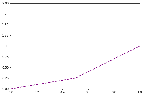
1
2
3
4
5
6
7
8
9
| # plot range
fig = plt.figure()
ax = fig.add_axes([0,0,1,1])
ax.plot(x,y,color='purple',lw=2,ls='--')
ax.set_xlim([0,1])
ax.set_ylim([0,2])
|
1
| <matplotlib.collections.PathCollection at 0x7fa305280190>
|
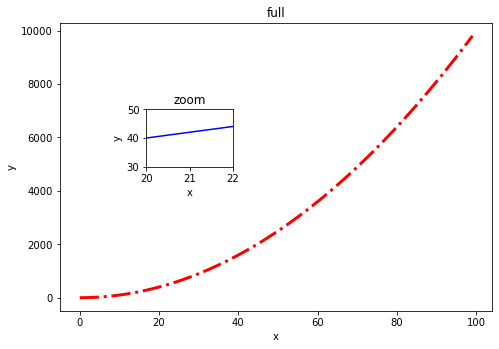
1
2
3
4
5
6
7
8
9
10
11
12
13
| axes1.plot(x,z,color='red', ls='-.', lw=3)
axes1.set_xlabel('x')
axes1.set_ylabel('y')
axes1.set_title('full')
axes2.plot(x,y,color='blue')
axes2.set_xlabel('x')
axes2.set_ylabel('y')
axes2.set_title('zoom')
axes2.set_xlim([20,22])
axes2.set_ylim([30,50])
fig # si può anche richiamare alla fine invece di reinizializzare la fig all'inizio della cella
|
1
| '/media/user/Public/Python/Course 001'
|
1
| <matplotlib.axes._subplots.AxesSubplot at 0x7efdb58a2b10>
|
1
| <matplotlib.axes._subplots.AxesSubplot at 0x7efdb0856a10>
|
1
| <matplotlib.axes._subplots.AxesSubplot at 0x7efdb032ced0>
|
1
| <matplotlib.axes._subplots.AxesSubplot at 0x7efdabfaa710>
|
1
| <matplotlib.axes._subplots.AxesSubplot at 0x7efdabb399d0>
|
1
| <matplotlib.axes._subplots.AxesSubplot at 0x7efdabab23d0>
|
1
2
3
4
5
6
| Index(['2000-01-01', '2000-01-02', '2000-01-03', '2000-01-04', '2000-01-05',
'2000-01-06', '2000-01-07', '2000-01-08', '2000-01-09', '2000-01-10',
...
'2002-09-17', '2002-09-18', '2002-09-19', '2002-09-20', '2002-09-21',
'2002-09-22', '2002-09-23', '2002-09-24', '2002-09-25', '2002-09-26'],
dtype='object', length=1000)
|
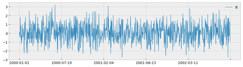
1
| <matplotlib.axes._subplots.AxesSubplot at 0x7efdab89d2d0>
|
1
| <matplotlib.axes._subplots.AxesSubplot at 0x7efdab6d9a50>
|
1
| <matplotlib.axes._subplots.AxesSubplot at 0x7efdab4c3790>
|
1
| <matplotlib.axes._subplots.AxesSubplot at 0x7efdaab90510>
|
1
| <matplotlib.axes._subplots.AxesSubplot at 0x7efdab11a150>
|
1
| <matplotlib.axes._subplots.AxesSubplot at 0x7efdab06edd0>
|
1
| <matplotlib.axes._subplots.AxesSubplot at 0x7efdab17a1d0>
|
1
| <matplotlib.legend.Legend at 0x7efdaabaa710>
|